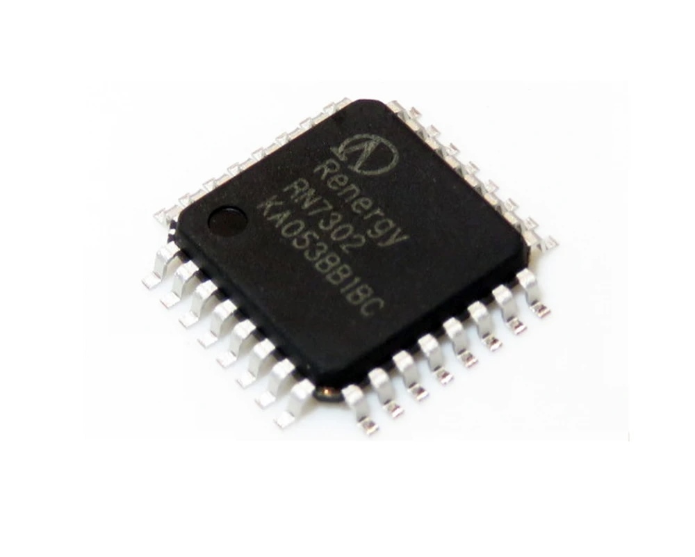
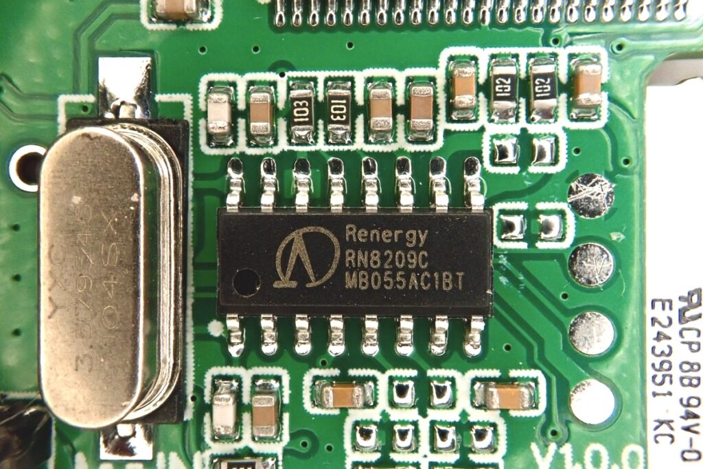
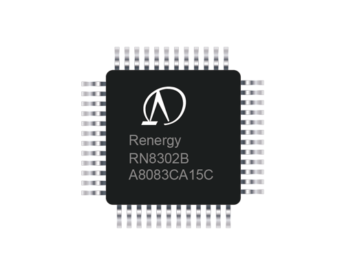
Logo for Renergy Micro-Technologies (2008–Now)
Work Statement
In 2008, I designed the visual identity for the startup Renergy Micro-Technologies. My intention was to use the purest geometric language to symbolize the company’s technological innovation and global vision.
The logo begins with a short, solid horizontal line—representing the substrate of a chip and the foundation of technology. From this center, driven by innovation, two trajectories converge at a single point, tracing the path of R&D ascending to the industry’s pinnacle. A circle then connects them, signifying how technological innovation, from its peak, extends toward the global market. The intentionally incomplete circle at the base suggests the infinite possibilities of human technological innovation.
For more than a decade, this emblem has accompanied the company from its early startup stage to its public listing, and from Shenzhen to the world. The “foundation–pinnacle–global” characteristics encoded in its form have been fully validated by the company’s growth trajectory.


